7.4 p-value Histograms
A p-value histogram visualizes the distribution of p-values from a collection of hypothesis tests. It is used as a diagnostic tool to check the validity of results prior to multiple testing correction.
hist(t_res1$P.Value,
     breaks = seq(0, 1, 0.05),
     main = "Histogram of p-values from PLATINUM.STATUS t-test Results",
     xlab = "p-value")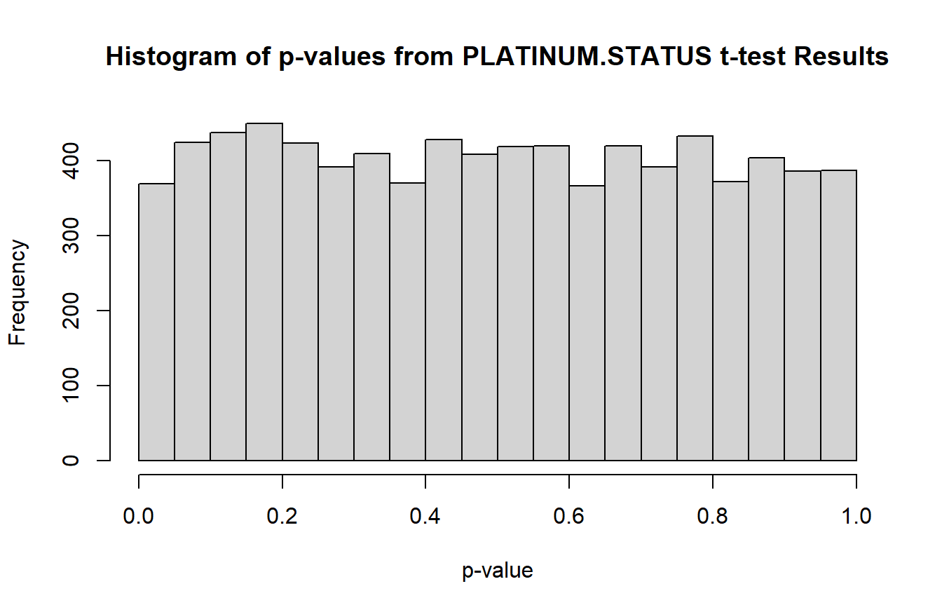
The histogram is uniform, which means it is unlikely that any features will be significantly different between any two PLATINUM.STATUS groups after adjustment for multiple comparisons. Indeed, when we check with sum(t_res1$adj.P.Val < 0.05), none of the features pass the significance threshold after BH adjustment.
hist(anova_res$P.Value,
     breaks = seq(0, 1, 0.05),
     main = "Histogram of p-values from SUBTYPE ANOVA Results",
     xlab = "p-value")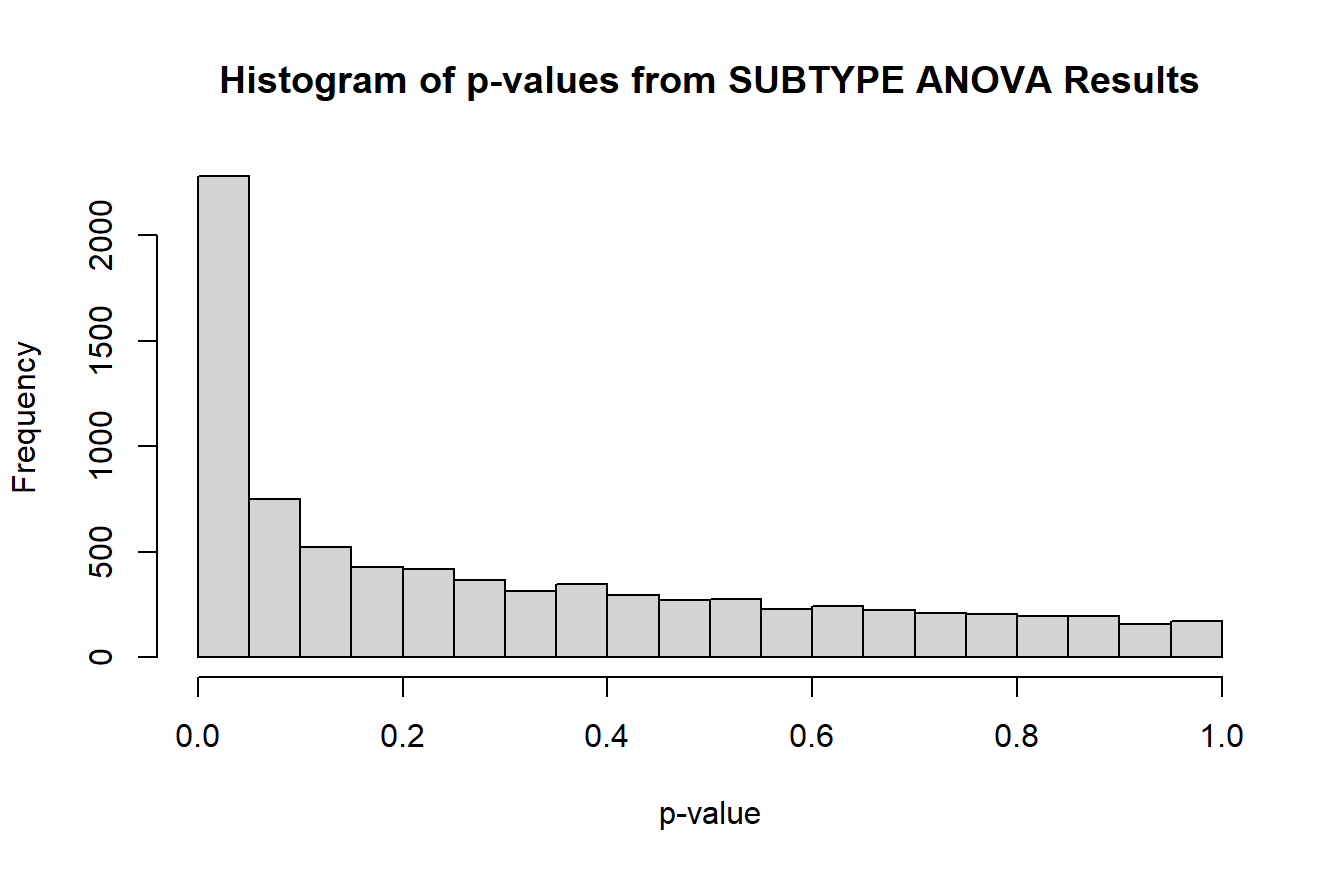
There is a peak around 0 that indicates the null hypothesis is false for some of the tests. If plotting results from limma_contrasts, it is better to use the ggplot2 package to create separate histograms for each contrast.
# Histogram faceted by contrast
ggplot(t_res2) +
  geom_histogram(aes(x = P.Value), breaks = seq(0, 1, 0.05),
                 color = "black", fill = "grey") +
  # Remove space between x-axis and min(y)
  scale_y_continuous(expand = expansion(c(0, 0.05))) +
  facet_wrap(vars(contrast)) + # separate plots
  theme_bw(base_size = 12)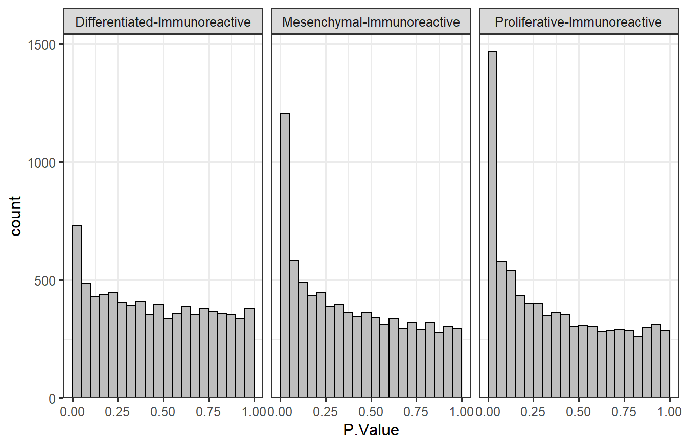
Based on the p-values, it appears that there are more features that are significantly different between the “Proliferative” vs. “Immunoreactive” comparison than the other two comparisons. The counts were shown at the end of Section 7.2.2.